
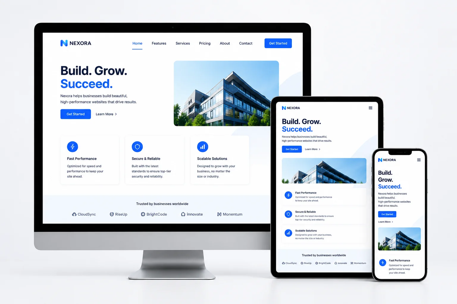
Creating websites that perform well on desktops, tablets, and smartphones requires a responsive design approach. Commonly known as RWD, it allows a website to automatically adjust its layout, images, content, and navigation based on the available screen size, browser window, device type, and orientation.
Instead of creating completely separate desktop and mobile websites, responsive website design uses flexible technologies to deliver a consistent and user-friendly experience from a single site.
For beginners, learning the main responsive web design principles can provide a strong foundation for creating accessible, mobile-friendly websites that perform well across different devices.
What Is Responsive Web Design?
Responsive web design involves building websites whose layouts can resize, shift, or reorganize as screen dimensions change. Its purpose is to keep content readable, navigation simple, and interactive elements accessible on every device.
The main components of responsive web design include:
- Flexible layouts
- Fluid grids
- CSS media queries
- Responsive images
- Resizable page elements
These features allow a webpage to respond dynamically instead of remaining fixed at one size. For example, a multi-column desktop layout may automatically change into a simpler single-column layout when viewed on a smartphone.
Why Responsive Website Design Matters
A responsive website can serve visitors across multiple devices without requiring a business to build and maintain separate mobile and desktop versions. This can reduce website design, development, and maintenance work while providing a more consistent user experience.
Responsive design is especially important because more people use mobile devices to browse websites, shop online, complete forms, manage banking activities, and research products or services.
Mobile e-commerce generated approximately $2.5 trillion in sales in 2025, while mobile devices are projected to account for 63 percent of e-commerce orders by 2029. Optimizing a website for mobile devices helps customers browse products, read content, move between pages, and complete purchases more easily on smaller screens.
Responsive website design may also support search engine optimization by improving mobile usability, page speed, visitor engagement, and the overall website experience.
Responsive Web Design vs. Adaptive Web Design
Responsive and adaptive web design both improve how websites display across different devices, but they use different methods.
Responsive web design uses one flexible layout that continuously changes according to the available screen space. It commonly relies on fluid grids, flexible elements, and CSS media queries. As the browser window becomes larger or smaller, the website adjusts automatically.
Adaptive web design uses several predefined layouts created for specific screen sizes or breakpoints. The website detects the screen dimensions or device type and loads the most appropriate layout. Once the layout has loaded, it generally remains static.
Responsive design may be more suitable for larger websites and new development projects because it can accommodate many different screen dimensions. Adaptive design may be useful when redesigning or updating a smaller existing website.
How Responsive Web Design Works
HTML and CSS form the technical foundation of responsive web design. HTML organizes the structure and information on a webpage, while CSS controls its layout, spacing, visual appearance, and presentation.
Several responsive web design techniques work together to create flexible pages.
CSS Media Queries
CSS media queries let developers change a webpage’s styling according to factors such as screen width, device orientation, resolution, and other display conditions.
For example, a media query can reduce heading sizes, reorganize columns, or change a navigation menu when a webpage is displayed on a smaller screen.
Fluid Grids and Flexible Layouts
Fluid grids use proportional measurements rather than fixed dimensions. This allows columns and page elements to expand or shrink according to the amount of available space.
Flexible layouts also help control the position and size of menus, buttons, forms, and other elements as the screen changes.
Responsive Images and Videos
Responsive images resize according to their containers so they do not extend beyond the available screen width. Video content and other embedded media can likewise be adjusted to fit smaller displays, helping prevent horizontal scrolling and disrupted page layouts.
Together, these responsive web design techniques help text, images, menus, forms, buttons, and videos remain functional across different devices.
How to Get Started With Responsive Web Design
The first step is to determine why you want to learn or use responsive design. You may want to build a business website, improve an existing site, develop professional web design skills, or understand the process before hiring a freelancer or agency.
Beginners should start by learning the core technologies and design principles involved in responsive website development.
Learn HTML and CSS
HTML and CSS are essential skills for creating responsive websites. Begin by learning how HTML structures page content and how CSS controls layouts, typography, spacing, and visual styles.
After learning the fundamentals, you can start using media queries, relative measurements, flexible grids, and responsive images.
Use a Mobile-First Design Approach
A mobile-first approach starts with the smallest display and then scales the layout up for tablets and desktop screens.
Starting with mobile devices encourages designers to focus on the most important content, navigation options, and user actions. Additional features and more complex layouts can then be introduced as more screen space becomes available.
Create Wireframes and Prototypes
Wireframes and prototypes can help you plan how a website should appear and function before development begins.
These tools allow you to test content placement, navigation, page structure, and responsive breakpoints without building the complete website first.
Test the Website Across Devices
Responsive website testing should be completed across different devices, browsers, orientations, and screen sizes.
Check that text remains readable, images resize correctly, navigation menus work properly, buttons are easy to select, and forms can be completed without difficulty. Testing can also help identify problems with page speed, overlapping elements, or horizontal scrolling.
Responsive Web Design Tips for Beginners
When building your first responsive website, keep the layout simple and focus on usability. Avoid overcrowding smaller screens with unnecessary content or complex design elements.
Use flexible measurements instead of relying entirely on fixed pixel widths. Compress and properly size images to improve loading speed, and ensure buttons and links are large enough for touchscreen use.
Reviewing responsive websites from different industries can also provide ideas for layouts, navigation systems, and mobile-friendly features.
Businesses hiring a web designer or agency should examine portfolios, previous responsive website projects, client reviews, technical experience, and the range of services offered.
Building a Better Mobile-Friendly Website
Responsive web design helps websites remain accessible, functional, and visually consistent across a growing range of devices and screen sizes.
By learning HTML, CSS, fluid grids, media queries, responsive images, mobile-first design, and cross-device testing, beginners can develop the skills needed to build more flexible websites.
Whether you are creating a new website or improving an existing one, applying responsive web design principles can provide a stronger experience for both desktop and mobile users.
