Web design is no longer simply about making a website look attractive. Modern websites need to be fast, accessible, intuitive, responsive, secure, and built around the needs of real users.
At the same time, artificial intelligence, evolving search experiences, new interaction patterns, and increasingly sophisticated personalization are changing how businesses approach their digital presence.
The most effective web design trends are therefore not just visual. They combine aesthetics with technology, usability, performance, accessibility, and measurable business objectives.
1. AI Is Transforming Web Design
Artificial intelligence is becoming an increasingly important part of the web design process and the websites themselves.
AI can support designers and developers with tasks such as content creation, image generation, prototyping, personalization, data analysis, and workflow automation. On the user side, AI can power conversational interfaces, intelligent search, product recommendations, and automated customer assistance.
However, AI should support good design rather than replace it.
A website still requires a clear brand identity, logical structure, accurate information, and a human-centred experience. Automatically generated content or visuals are not a substitute for thoughtful strategy.
The strongest implementations use AI where it provides genuine value while maintaining human oversight and consistency.
2. Bold Visuals and Strong Typography
Websites are becoming increasingly confident in their visual presentation.
Large typography, distinctive typefaces, strong contrasts, immersive imagery, and carefully selected colour palettes can help businesses establish an immediate visual identity.
Typography is particularly important because it does more than make a page attractive. It establishes hierarchy, communicates personality, and helps visitors understand what deserves their attention.
The objective is not to make every element compete for attention. Effective design uses visual hierarchy to guide visitors naturally from the main message to supporting information and, ultimately, to the desired action.
3. Micro-Interactions Make Websites Feel More Responsive
Small interactive details can have a significant impact on how a website feels.
Micro-interactions can include:
- Animated buttons
- Hover effects
- Progress indicators
- Form confirmations
- Loading animations
- Scroll-based effects
- Interactive menus
- Visual feedback after an action
These details provide users with immediate feedback and can make an interface feel more intuitive.
The key is restraint. Animation should communicate, guide, or reinforce an action, rather than slow down the website or distract visitors from important information.
4. Performance Is Part of the Design
A visually impressive website loses much of its value if visitors have to wait for it to load.
Modern web design increasingly treats performance as a fundamental part of the user experience. Large images, unnecessary scripts, excessive animations, poorly optimized code, and third-party services can all affect loading and responsiveness.
Performance optimization can include:
- Compressing and properly sizing images
- Using modern image formats
- Reducing unnecessary scripts
- Improving server response times
- Implementing efficient caching
- Loading resources intelligently
- Limiting unnecessary animations
Google’s Core Web Vitals also place particular emphasis on loading performance, responsiveness, and visual stability.
A fast website is not merely technically better. It provides visitors with a smoother experience and can support stronger engagement and conversions.
5. Minimalism Is Becoming More Purposeful
Minimalist design remains popular, but modern minimalism is about much more than space and simple colour schemes.
The objective is to remove anything that does not contribute to the user’s experience.
A well-designed minimalist website typically features:
- Clear navigation
- Strong visual hierarchy
- Focused messaging
- Generous spacing
- Consistent typography
- Purposeful imagery
- Prominent calls to action
Minimalism can make complicated information easier to understand while reducing the cognitive effort required to navigate a website.
6. Accessibility Is Becoming Essential
Accessibility should no longer be treated as an optional feature added at the end of a web project.
A modern website should be usable by as many people as reasonably possible, including visitors who rely on keyboards, screen readers, enlarged text, captions, or other assistive technologies.
Important accessibility considerations include:
- Sufficient colour contrast
- Keyboard-friendly navigation
- Meaningful link and button labels
- Descriptive alternative text for relevant images
- Logical heading structures
- Accessible forms
- Captions and transcripts where appropriate
- Proper focus states
- Compatibility with assistive technologies
Accessible design frequently improves usability for everyone, not only users with disabilities.
7. Personalization Is Becoming More Intelligent
Personalization has evolved beyond simply displaying a visitor’s name.
Websites can use information about user behaviour, preferences, previous interactions, and context to present more relevant content or recommendations.
For example, an ecommerce website might highlight products related to previous browsing activity, while a service business might direct returning visitors toward information relevant to their previous interests.
Personalization needs to be handled carefully, however. Relevance should never come at the expense of privacy or user trust.
Businesses should make responsible use of customer data and avoid creating experiences that feel intrusive.
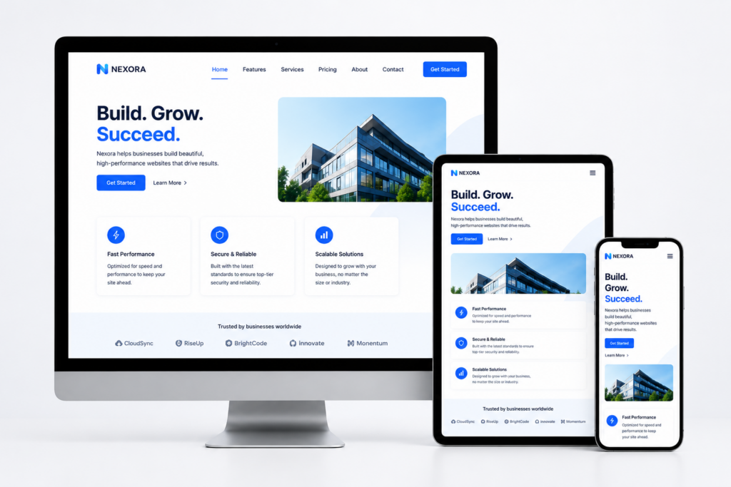
8. Mobile-First Design Remains Critical
A website cannot be considered successful if it only works well on a desktop computer.
Visitors use smartphones and tablets with different screen sizes, connection speeds, operating systems, and interaction methods. Modern web design therefore needs to consider mobile experiences from the beginning rather than treating them as a secondary version of the desktop site.
Mobile-first design means considering:
- Touch-friendly controls
- Readable typography
- Simple navigation
- Fast loading
- Responsive layouts
- Appropriately sized images
- Shorter and clearer forms
- Easily accessible calls to action
Responsive design should ensure that the website adapts smoothly rather than simply shrinking a desktop layout onto a smaller screen.
9. Interactive and Immersive Experiences Are Expanding
Interactive elements can turn passive browsing into active exploration.
Interactive product demonstrations, animated storytelling, 3D models, virtual tours, configurators, maps, and other immersive experiences can be particularly valuable when visitors need to understand something visually.
For example, a real estate company could use interactive property tours, while an ecommerce business could allow customers to explore products from multiple angles.
These technologies should have a clear purpose. Immersion is valuable when it helps users understand, compare, explore, or make decisions.
10. Navigation Is Becoming Simpler
As websites become more sophisticated, navigation is often becoming more streamlined rather than more complicated.
Visitors should be able to understand where they are, what the business offers, and where they should go next without having to search through layers of unnecessary menus.
Clear navigation can include:
- Descriptive menu labels
- Logical page groupings
- Search functionality where appropriate
- Breadcrumbs on larger websites
- Sticky navigation when useful
- Clear calls to action
Good navigation reduces friction and helps users reach important information more quickly.
11. Dark Mode and User Preferences
Dark mode has moved beyond being a novelty.
Many users appreciate the option to switch between light and dark interfaces, particularly in low-light environments. Supporting system preferences can also create a more personalized experience without requiring visitors to configure the website manually.
However, dark mode needs to be designed carefully. Contrast, readability, imagery, icons, forms, and interactive states all need to remain clear in both themes.
The broader principle is important: websites should adapt to users where practical rather than forcing everyone into the same experience.
12. Sustainability Is Influencing Digital Design
Sustainability is increasingly being considered during website planning and development.
Every website requires resources to deliver content, process requests, store information, and display media. Large images, unnecessary videos, excessive scripts, and inefficient code can increase the resources required to operate a website.
More efficient design can therefore have both performance and sustainability benefits.
Businesses can reduce unnecessary digital weight by:
- Optimizing images and video
- Removing unused code
- Limiting unnecessary animations
- Choosing efficient hosting solutions
- Reducing excessive third-party scripts
- Designing pages around essential content
A lighter website can be faster, easier to use, and more resource-efficient at the same time.
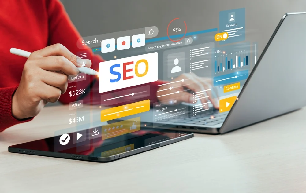
13. Search and Web Design Are Becoming More Closely Connected
Web design and SEO can no longer be treated as completely separate disciplines.
The structure of a website affects how easily users and search engines can understand its content. Clear headings, logical navigation, descriptive links, crawlable pages, mobile usability, fast performance, and accessible content can all contribute to a stronger digital foundation.
The emergence of AI-powered search makes clear information architecture even more important.
Businesses should structure their websites so that important information is easy to discover, understand, interpret, and connect with related content.
A beautiful website that cannot be effectively crawled, understood, or used is not performing to its full potential.
14. Websites Are Becoming More Conversion-Focused
Modern web design increasingly connects visual decisions with measurable business outcomes.
Instead of asking only whether a website looks professional, businesses should also ask:
- Does the website communicate the value proposition immediately?
- Can visitors find important information quickly?
- Are calls to action clear?
- Is the contact or purchasing process simple?
- Does the website build trust?
- Does the design remove unnecessary friction?
- Does the experience support the customer journey?
Conversion-focused design does not mean turning every page into a sales pitch.
It means making it easier for visitors to take the next logical step, whether that is requesting information, making a purchase, booking an appointment, downloading a resource, or contacting the business.
Web Design Is Moving Toward Smarter Experiences
The future of web design is not defined by one particular colour palette, animation style, or visual trend.
Instead, the strongest websites combine excellent design, intelligent technology, accessibility, performance, personalization, and a clear understanding of user behaviour.
AI will continue to influence how websites are designed and experienced. Interactive technologies will create new opportunities for engagement, while accessibility, speed, privacy, and usability will remain fundamental requirements.
Businesses that invest in their websites should therefore look beyond temporary design trends and focus on creating digital experiences that remain useful, flexible, and effective as technology continues to evolve.
At MRKT360, we combine strategy, design, development, SEO, and digital marketing to create websites designed around both user experience and business performance. Our web design services can help your business build a faster, more effective, and conversion-focused digital presence.
Contact us today to discuss how your website can be improved and prepared for the next generation of digital experiences.