

Design principles are one of the most important things to consider when designing advertising campaigns, posters, flyers, motion graphics, and other elements that can boost a brand’s effectiveness within the digital marketing world.
Even if you aren’t a graphic designer, it is important to learn basic design principles to improve your visual thinking and better communicate with your team.
Let’s say you are a project manager and your designer tells you something like this:
“We were thinking of going with a minimalistic approach. However, we haven’t decided if we want to change the typography hierarchy instead of using other design elements or creating balance with shapes along the sides. What do you think?”
Would you be able to follow the conversation? There’s a difference between understanding what the designer meant and thinking you do.
The keyword in there is hierarchy . This blog will explain the concept of hierarchy in design and why you should use it in your campaigns.
What is hierarchy in design?
Hierarchy is one of the fundamental design principles. It is present everywhere you look at when regarding design, as it creates an order of importance within a design’s elements. It also directs attention while making information easy to understand for the viewer.
It is always amazing to see how a simple design can generate leads, create conversions, make people interact with your ad campaigns, and boost your online presence using the concept of hierarchy.
Hierarchy follows a three-step process in marketing design:
- Attract
- Intrigue
- Deliver the message
These are the three steps a viewer will go through when looking at your designs without even being aware that it is happening.
Let’s take a look at an example of these steps happening. Let’s take a look at this ad from Adidas:
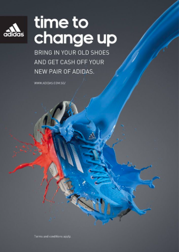
The shoe and the paint splash is the aspect that will attract the attention of viewers, drawing it into the design. The quote “time to change up” will create intrigue or curiosity in the viewer, making them read further into the design. Then we have the message delivered right below it.
This occurs because the design works like a trap. It draws you in long enough to read the message the brand wanted to convey through their ad.
When using hierarchy in your designs, you can use several versions of it in a single product.
Colour Hierarchy
Colour is essential. It is a way to attract attention and place things in a certain order. There is an established order of colours that attract the most attention to the least depending on whether they are on a dark or light background:
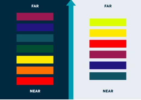
A design that utilizes too many contrasting colours will appear disorganized and all over the place. The same can be said about designs that use a colour scheme that doesn’t follow colour theory.
Similar colours can be used to group elements together within a design. Warmer colours like red on a dark background will usually grab the attention of people first. This is typically the reason why alerts and notifications often being red or orange. Using a single, high-contrasting colour in your designs is a way for you to grab the attention of the viewer easily:
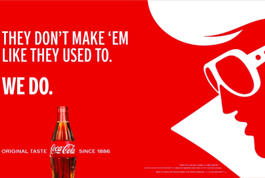
You can draw people’s attention to a specific area of the design through colour hierarchy alone. A common tactic is to have a grayscale or dark-monotone design with a few single elements in a single colour to draw attention:

Size Hierarchy
Leveraging the use of size is another form of hierarchy in design. This is most commonly used in posters, banners, magazines and web designs, though it can have other applications.
The larger something is on a design, the more important it is going to seem. It’s also the first thing someone sees when looking at a design. Size can be used as part of the attract phase of the hierarchy process.
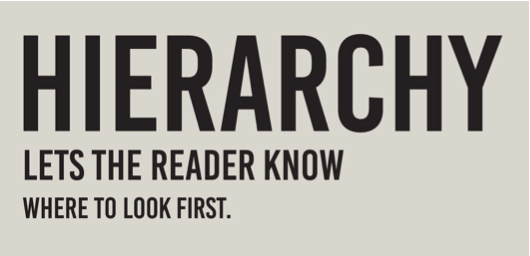
An of size hierarchy is font hierarchy. Main headings will be large, composed of a few words or sentences, usually used to attract the user’s attention while scrolling on their phones or walking down the street. Then there will be a secondary heading that is slightly smaller than the main title, utilized to hook the viewer and intrigue them. Finally, the smaller text, usually the one to convey the message of the design:
Having fonts in different sizes and weights will make your ads more attractive instead of only one font size. However, you must be careful not to overdo it. More than two-three types of different fonts is usually overkill.
You can also see examples of size hierarchy in ads promoting tech products such as smartphones and smartwatches. They usually use their product and depict it as something big, a focal point, within the design:
Design and manage effective ad campaigns that deliver your message
Of course, all design principles have a time and place to be applied, but hierarchy is consistent in most ad campaigns as a means to draw in the viewer and make them resonate with your message.
Do you use hierarchy in your ad designs? Designing effective advertisements can mean the difference between a home run or a miss.
If you want to learn more about creating and managing effective ad designs that attract consumers to your brand, contact Mrkt360 today. We specialize in designing effective ad campaigns, SEO strategies, and other digital marketing solutions that will help your brand grow!