
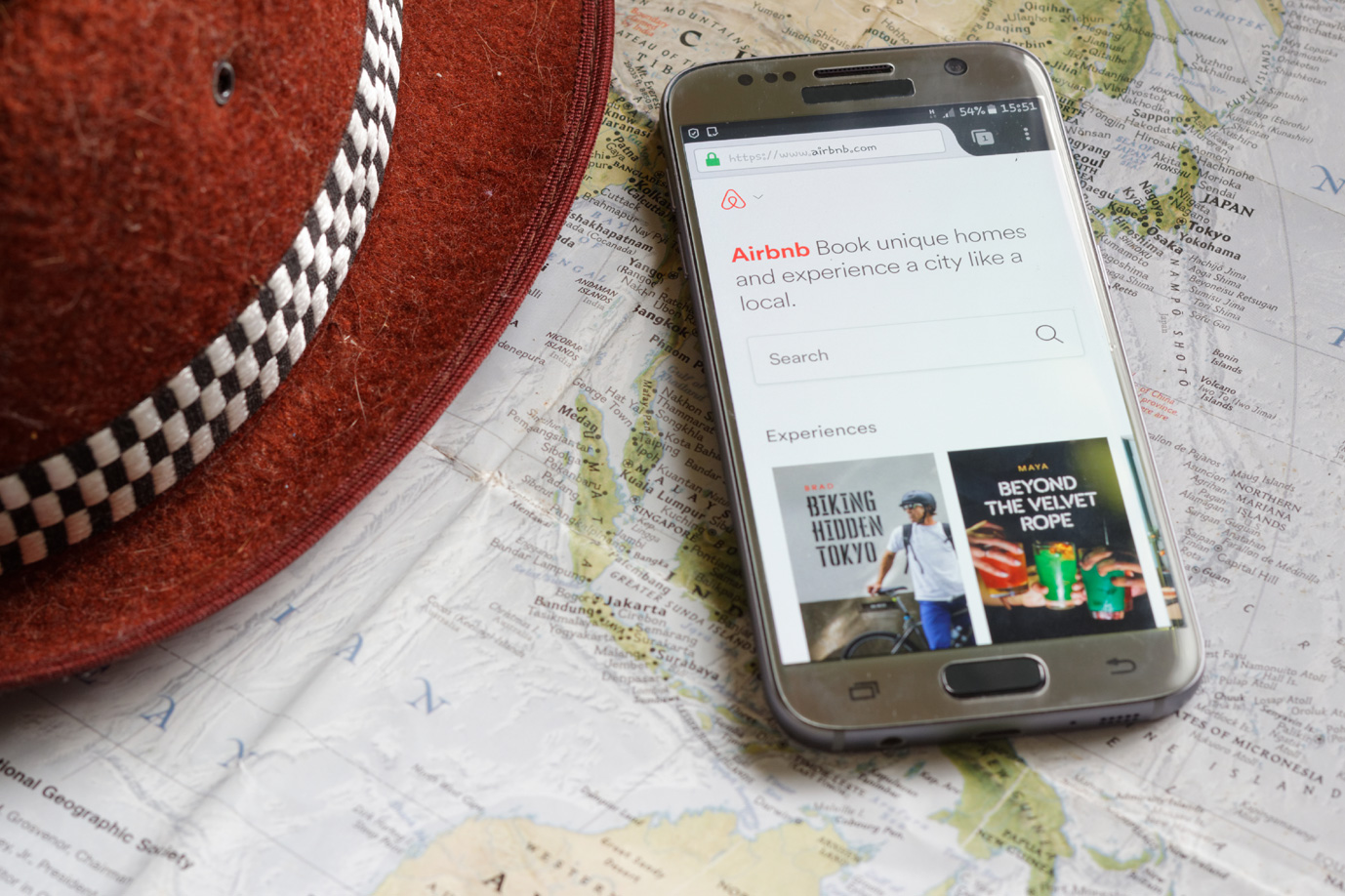
Given the shift in consumer search patterns, it is no surprise that business owners are continuously trying to improve the mobile experience. More than ever, people are engaging with their phones in crucial moments and for short period of times. Their experience need to efficient and fast, as people are very impatient. Plus, a well designed mobile friendly website provides you a competitive advantage in the market.
To keep pace with the evolving mobile world, business owners need to start thinking of mobile as a primary project goal, not something tacked onto a desktop centric project as a side thought. Whether your business has fully adopted a mobile first though process or you’re still figuring out the best route to take, make sure that you are keeping these Google design principles in mind!
1. Page Speed Converts to $$
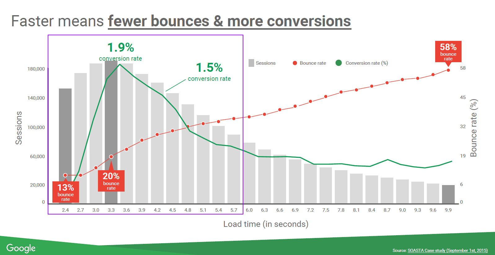
Consumers are impatient as ever. Since many people are accessing the web to find quick answers to specific moments, it’s important that you don’t leave them waiting! According to SOATSA, mobile pages that are 1 second faster experience up to 27% increase in conversion rate.
In other words, for your mobile ads to have a top level conversion, your website should load between 2-5 seconds. If your mobile site is taking an average of 9 seconds to load, you’re looking at a 58% bounce rate! Users will click on your website but leave immediately if it takes too long to load. Moral of the story: reduce your load time for your page. You can check your website load time through Web Page Test.
2. Clear Value Proposition
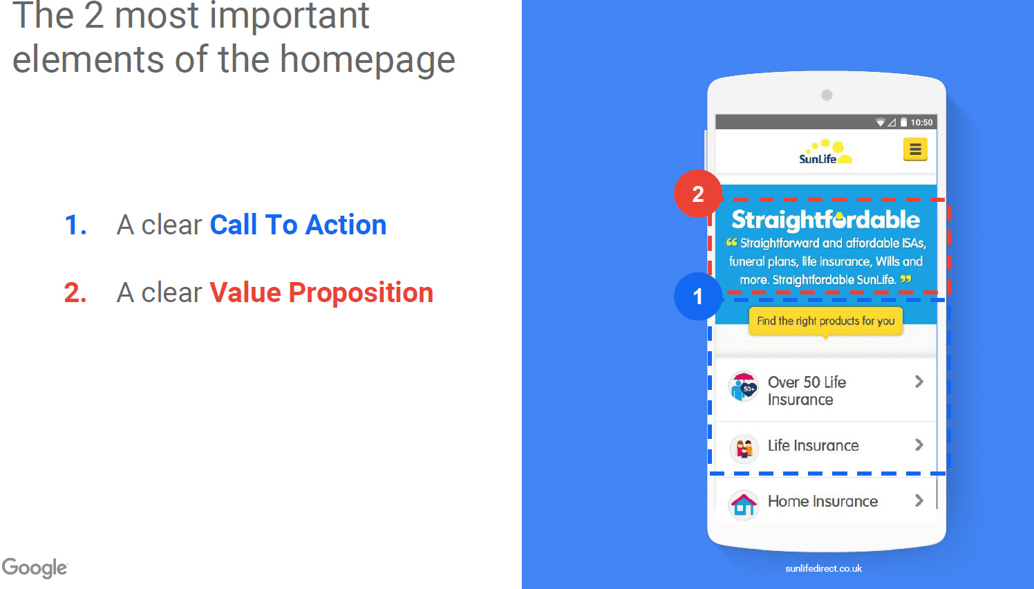
The user should see a clear call-to-action button and value proposition on the home page as soon as they open the site.
Present your value proposition as the first thing visitors see on your landing pages.
Value proposition is a clear statement that:
- explains how your product solves customers’ problems or improves their situation
- delivers specific benefits
- tells the ideal customer why they should use your service and not from the competition
Your value proposition should be the first thing the visitors see on your homepage, but it should also be visible in all major entry points of the site.
If your main landing pages don’t have a value proposition or they don’t understand it, you are losing sales and confusing the customer. Make sure that your value proposition is clear.
3. Easy and Functional Usability
a) Sliding Carousels images:
Avoid sliding carousels image on the homepage for your mobile design. The truth is they are conversion killers. Even conversion optimization experts agree that it’s not efficient.
“We have tested rotating offers many times and have found it to be a poor way of presenting home page content.” – Chris Goward, Wider Funnel
“Rotating banners are evil and should be removed immediately.” – Tim Ash, Site Tuners
Jakob Nielsen ran a usability study where users were given the following task: “Does Siemens have any special deals on washing machines?”. The information was on the most prominent slide. The users could not see it – totally hit by banner blindness. Nielsen concludes the sliders are ignored.
Summary: Rotating carousel images should be avoided at all costs.
b) Picking color of a call-to-action button
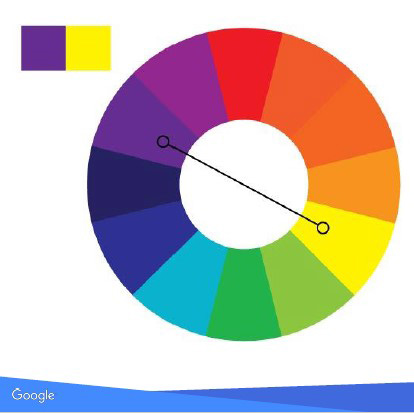
Did you ever spend hours trying to pick a call to action button color? No need to waste time on figure it out anymore, we now have data to back up which color to choose. The color that contrasts best with the web page’s background color is the one that will make your call to action button stand out on the page.
This color wheel depicts contrasting CTA colors opposite to their main colors. You can simply pick the color shown opposite to your site’s background color from the color wheel and test it out.
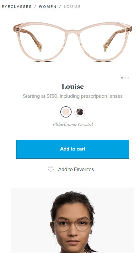
If your website background is white, the most highly converting color is a rich blue. It’s easy to view on a white background.
Source: Visit the Warby Parker website for an example
Conclusion
If you want to want to win in the mobile world, you need to make sure that you are making it easy for the person to use your website. If you use these principles when you are designing your website, you will end up with a more converting website.
Keep them in mind whenever you start a new design project.