
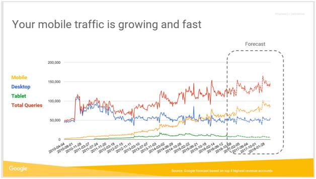
Following on the high interest that we’ve received from our previous post on mobile, we decided to create a follow up post with more tips on optimizing for an absolute mobile experience. We’ve had several meeting with Google representatives who have shared with us statistics and research on mobile optimization.
Even more reason to hop on the mobile bandwagon, Google’s Gary Illyes announced they plan on releasing a separate mobile search index, which will become the primary one. As Google adapts their search engine to include mobile indexing, each company will have to adapt their website to meet these evolving requirements. It’s never to early to re-analyze your current website and come up with ways to make it more mobile friendly.
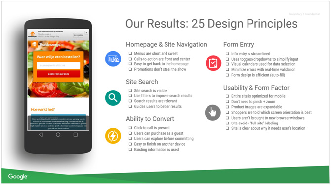
We’ve come up with a list of recommendations that you may want to implement when re-looking at your mobile strategy. Make sure to pay attention to these 25 design principles when working on your mobile design.
- Present a value proposition as the first thing visitors see on your landing page
A value proposition is a promise of value to be delivered. It’s the main reason a prospect should buy from you rather than your competition.
A value proposition is a clear statement that explains how your product solves customers’ problems or improves their situation (relevancy), delivers specific benefits (quantified value),tells the ideal customer why they should buy from you and not from the competition (unique differentiation).
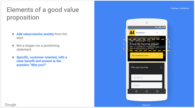
Based on research conducted, you should present your value proposition as the first thing visitors see on your homepage, but should be visible in all major entry points of the site.If your main landing pages (home page, product page etc) don’t have a value proposition, you are in danger of losing sales.
The main question you need to answer for them is ‘why should I buy from you?’. If you don’t have a compelling value proposition your potential customer will not know why they should buy from you. You need to make it clear as to why you’re different – particularly if you are a lot more expensive than the competition.
Today’s buyer is constantly comparing products by visiting multiple websites. They are usually comparing price, quality, and value. If you are not clearly communicating this information to them, you are losing. If people can’t understand the differences between your product and that of your competitor, they’re going to choose based on the price. “If it’s all the same, why pay more!?”
State your advantages and differences on your home page and on product pages. A lot of software companies do this really successfully by creating comparison charts. Thus, making it easy and quick for the potential customer to compare your company to others.
People who are conducting research are looking for information to help them make a decision. You need to provide them with information so that are able to make a purchasing decision.
If you rush the sale – ask for a sign-up before they have enough information, you will scare them away. Here’s a good case for burying your signup or buy button. One company removed the sign up call to action from the top of the homepage, and sign-ups increased 350%.
- The Menu Bar
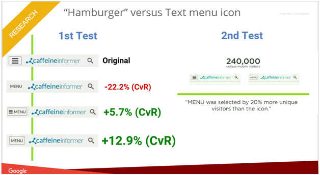
A lot of websites are using this icon:

Also known as: hamburger, sandwich, and even hotdog ?! What it actually is, is a list icon or a navigation menu. A study was conducted with about 250k visits. The conclusion was that people using the word MENU (and making it look like a button) could be more helpful for visitors.
This does not mean that users do not understand the hamburger/sandwich – it could be that the word MENU draws more attention.Even more interesting is that changing your icon to the menu has the potential to increase conversions by 12%! Making sure that you understand this type of user experience research will help you design a better experience for your visitors.
At the end of the day, the burning question is this: Is there still a role for the hamburger menu in today’s mobile world? Its role is still a central one. As people become increasingly reliant on their mobile devices and expect the full functionality of desktop experiences on mobile, the need for delivering extensive functionality packaged within a small icon is more acute than ever.
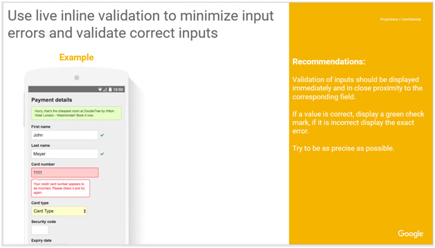
- User friendly forms
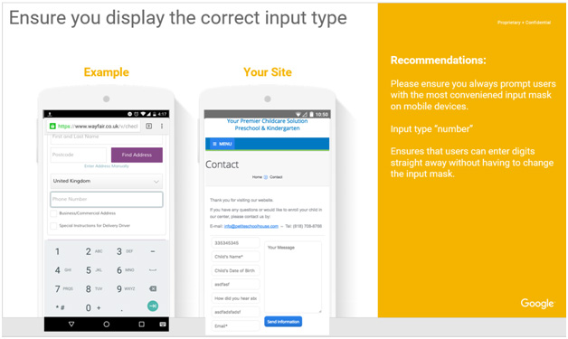
Using smart defaults or pre-filling form fields with educated guesses removes the amount of work users have to do. This is a common technique for helping users move through forms faster by being respectful of their limited time. The goal is to simplify the user experience as much as possible by helping them pre-populate their information. Try to display fields that are preloaded with values to be validated as opposed to asking for values to be retyped each time. The less work, the better.
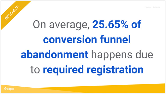
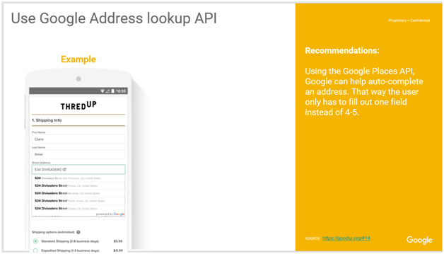
People generally are resistant to labour intensive tasks including filling out forms. At each field, you run the risk of losing the visitor because they get tired of filling out information. It’s recommended that you take a hard look at each field to see if it’s necessary. Try using Google API for address to help auto-complete the form.
Conclusion and three really important takeaways
Takeaway #1: Value proposition should be the first thing a user sees
Make sure that you are clear with the different between your product/services compared to your competitor. Tell the visitor how much you rock. It should be written in a very clear and precise manner so it’s easy for the visitor to want to complete the transaction with you.
Takeaway #2: UX is super important
Keep in mind as well that Google really likes a good UX. Your visitors also want to make sure that your website is easy to use. Stay away from icons that are confusing (i.e., hamburger menu) You need both to optimize speed and user experience to improve your rankings.
Take away #3: Make it easy for the user
We are trying to continually learn about what makes user interfaces better by trying these ideas out in various combinations on real optimization projects. Our goal is to build a really quality design that is easy to use for the visitor.
We are always eager to hear success stories — how data like this has a real world impact. Tell me what changes you made on your site, and how it improved things!
