
Burger King, the American fast-food chain, has rebranded for the first time in two decades. They recently announced switching back to an old (yet modernized) design they used before 1999, featuring a much more simple and flat design.
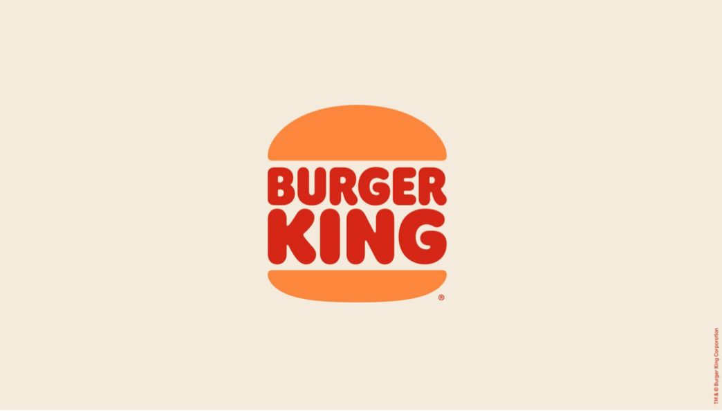
The restaurant chain has updated all brand elements to match this new logo, presented by the creative agency Jones Knowles Ritchie.
“It was time for their visual identity to reflect the rest of their business by creating a brand world that modern consumers could feel good about,” stated Jones Knowles Ritchie.
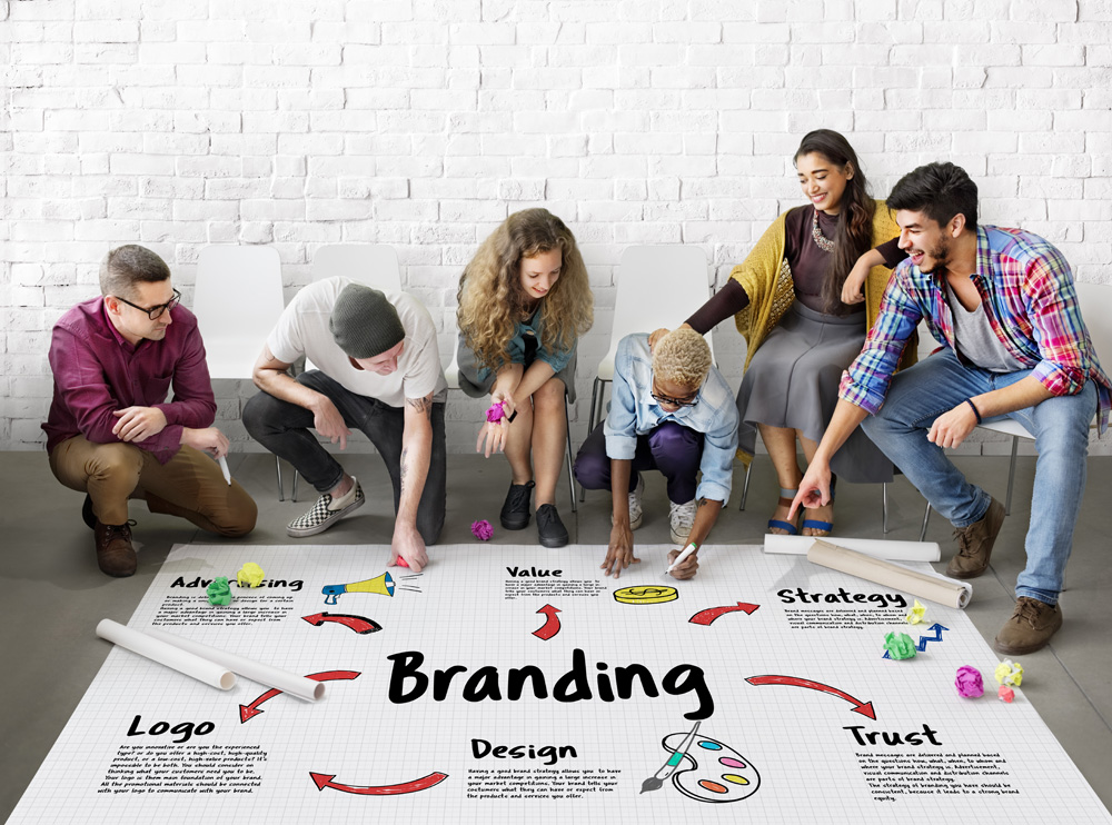
But what does that mean exactly? We can work through further brand examples to explain precisely what it means, illustrating the idea of visual identity and making consumers “feel good”.
Branding Involves Constant Change
The world of branding is continuously changing, as it has for decades. But this time, brands and logos are heading in a much more refined and simplistic direction.
But why?
Modern consumers crave simplicity in a constantly evolving digital landscape. Our lives, technology and environment are becoming increasingly complex.
The amount of information we are exposed to regularly makes us want simpler things: simpler reservations, simpler apps, and a simpler life in general.
However, humans craving simplicity is just one of the reasons why branding is becoming more refined and raw.
A New Attention Span
The attention span of an ordinary person has nosedived in recent years. The digital age of information has changed the general attention span of the end consumer. The Technical University of Denmark published a study which suggests that global attention spans are becoming shorter due to the massive amounts of information consumed daily.
Whether through commercials, apps, or social media, digital platforms provide rich content instantly and continuously, sometimes drowning users with overflows of information.
In addition, we are being bombarded with information on increasingly smaller screens. In comparison to television or desktop computers, we spend most of our time consuming media through our phones.
More time spent on our phones and smaller screens means that the competition for attention among brands is fierce, especially when it comes to logo design. With a user interface full of buttons, icons and other UI elements, a logo can get lost relatively easily.
It makes sense to refine and simplify branding aspects, like a webpage or logo design to match what the modern client prefers. The objective is to become simply yet distinct.
Rebrand Examples
We already know what Burger King is doing it, so let’s take a look at some other recent rebranding examples which feature this simplistic design philosophy:
- Nissan
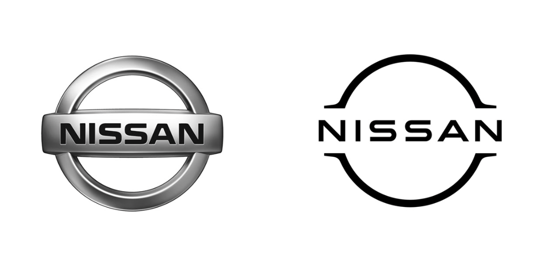
 Nissan opted for a digitized version of their crest, which the brand has used for years. Their new logo was released in 2020, offering a simple and fresh version of the original crest. By removing the gradient and sticking to all black, the latest version of the crest screams modernity.
 - Fnatic
 Gaming eSports brand Fnatic opted to subtly adjust their logo into a more minimalistic direction. Their shift toward a bolder shade of orange and less complex logo allowed one of the most recognizable eSports brands to modernize itself, without giving up on its essence.
 - UserZoom
 Probably my favourite rebranding concept on the list. Userzoom is a UX insight provider in London. Their new logo completely ascends them into the modern age, while retaining their friendly and functional brand messaging.
 - Belgian Pro League

The Belgian Pro League’s change is transformational. Clean, modern, sharp, and simple. Long needing a change; by applying a new logo, font, and colour scheme, the Belgian brand managed to get everything right.
 Nissan opted for a digitized version of their crest, which the brand has used for years. Their new logo was released in 2020, offering a simple and fresh version of the original crest. By removing the gradient and sticking to all black, the latest version of the crest screams modernity.
 Gaming eSports brand Fnatic opted to subtly adjust their logo into a more minimalistic direction. Their shift toward a bolder shade of orange and less complex logo allowed one of the most recognizable eSports brands to modernize itself, without giving up on its essence.
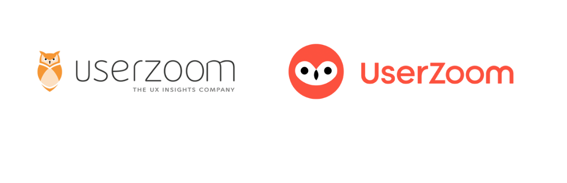 Probably my favourite rebranding concept on the list. Userzoom is a UX insight provider in London. Their new logo completely ascends them into the modern age, while retaining their friendly and functional brand messaging.
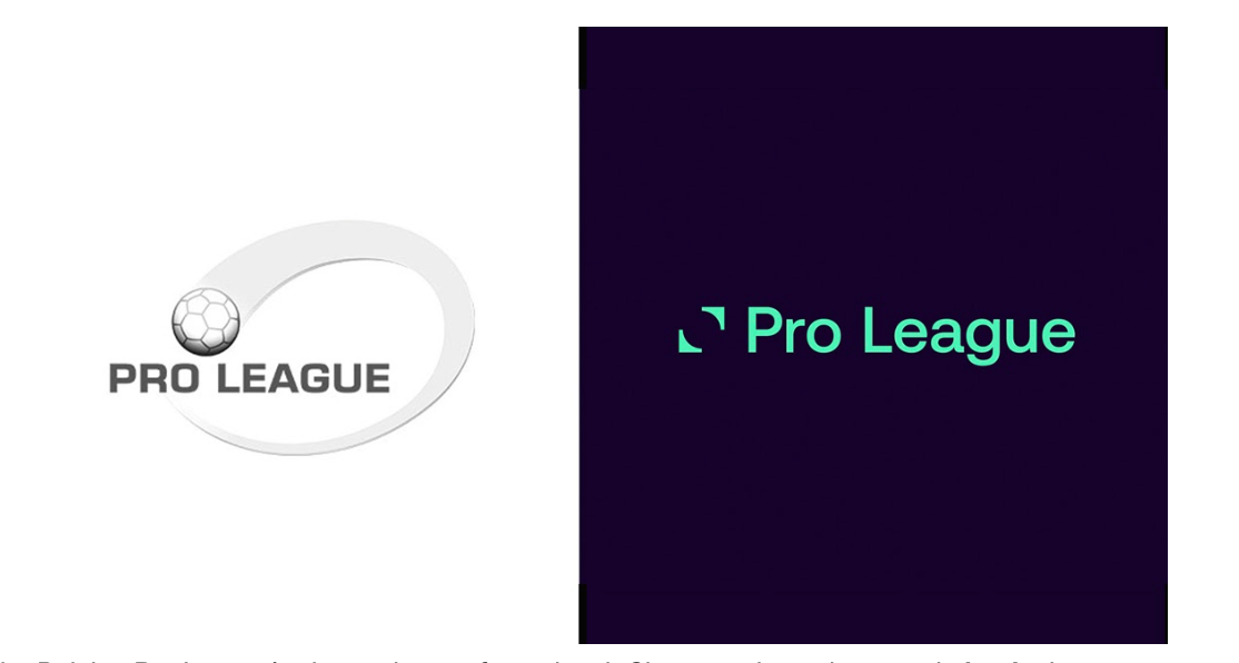
Logo Designing and Branding in 2021: Are you ready?
So what is the takeaway here? Why is this new trend so important?
Any brand wants its image to stand out, be memorable, and stick in consumers’ minds like glue. Doing this in a matter of seconds is crucial for a brand’s success.
When branding (or rebranding) you need to be aware of the environment you’re in. Imagining your brand with gradients, drop shadows, multiple colours, and detailed images is a thing of the past.
People have less time to look at your brand. That means you need to be smart about your approach because you need to target the end consumer in the most effective and quickest way possible.
There are many other examples of rebranding not just in 2020 but in recent years. The world is continuously becoming more modernized, and consumers have less time, less attention, while also viewing information on devices with much less space.
The branding and marketing ecosystem changed drastically last year, albeit rather forcibly. Adapting to new consumer demands and design trends is necessary for survival. At Mrkt360, we know that implementing new technologies and understanding how everything is evolving is key to brand success.
So this begs the question; is your brand 2021 ready?