
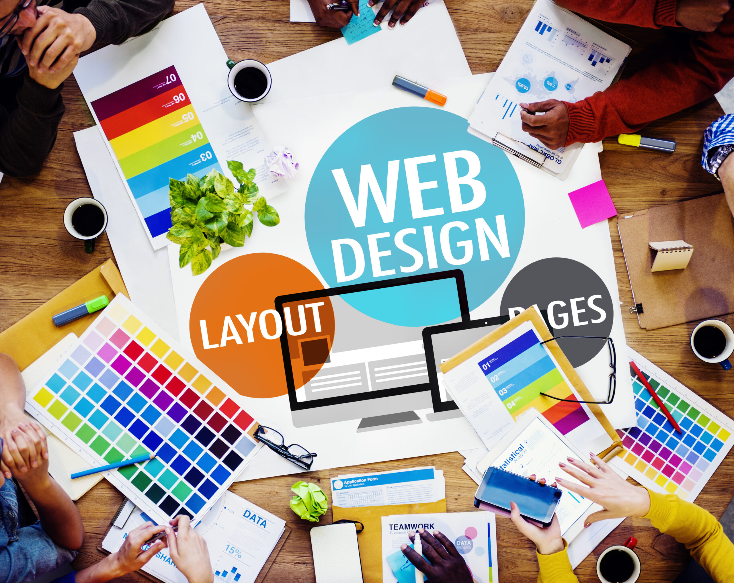
The Power of Web Design in Shaping User Behavior
The importance of web design extends far beyond mere aesthetics. It serves as the initial touchpoint between a user and a website, setting the stage for interaction. A well-crafted website harnesses the potential to guide user behaviour, encouraging prolonged engagement, exploration, and conversion.
Web design encompasses the visual elements, user interface, content, and overall functionality that collectively forge a seamless user experience.
The synergy of these components is crucial; for example, a site with stunning visuals but lacklustre content may fail to hold user interest, while rich content presented through a cumbersome interface can deter user navigation.
Visual Appeal: The Magnet of Engagement
Visual appeal acts as a formidable magnet for user engagement in the realm of website design. The initial element captures a user’s attention and plays a crucial role in shaping their first impression.
It encompasses various design elements, including colour schemes, typography, imagery, layout, and overall aesthetic harmony. Each component can create an inviting and memorable user experience when thoughtfully integrated.
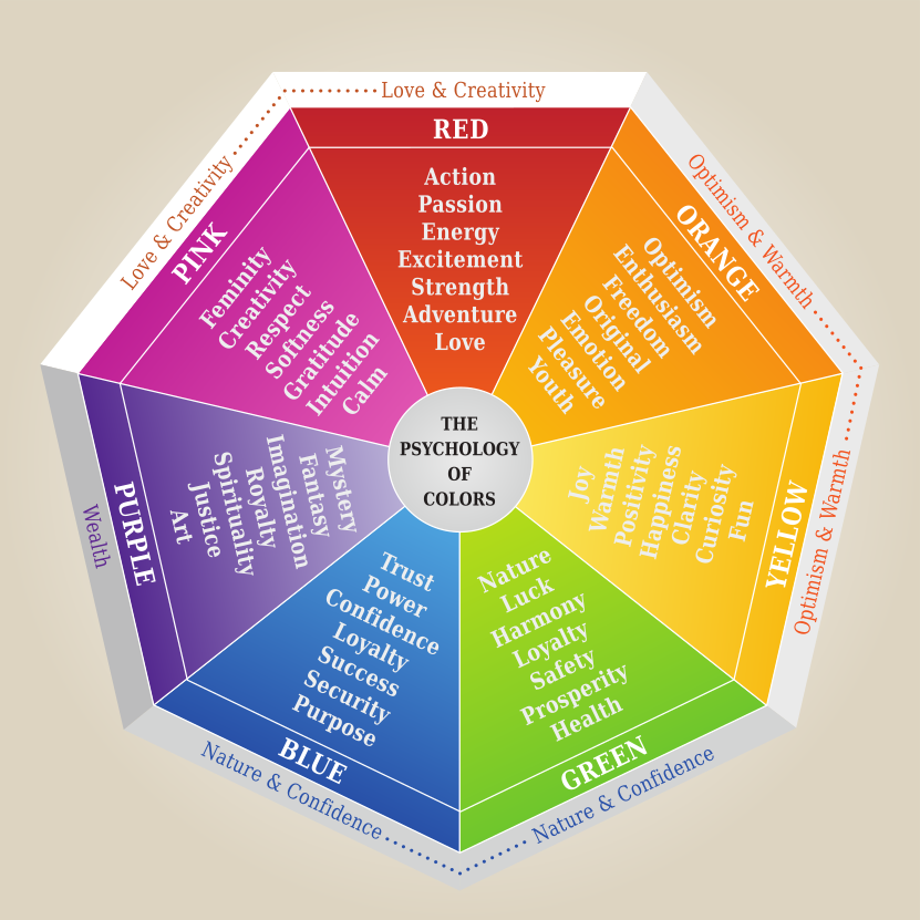
Colour Psychology in Web Design
Colour is a powerful tool in web design that can evoke emotions, convey messages, and influence perceptions. The psychology behind colour choices can significantly impact user behaviour. For instance, blue can evoke feelings of trust and professionalism, making it a popular choice for corporate websites. In contrast, warmer tones like red or orange can stimulate excitement or urgency, often used in call-to-action buttons to encourage clicks.
Typography That Speaks
Typography is more than selecting fonts; it creates a readable and harmonious visual hierarchy. Choosing typefaces, size, spacing, and colour should ensure legibility and enhance the overall design aesthetic. Good typography guides the user through the content effortlessly, making the text engaging and accessible.
Imagery and Multimedia
High-quality, relevant images and videos can significantly enhance the visual appeal of a website. They break up text-heavy pages, illustrate concepts, and can convey brand stories more effectively than words alone. In today’s fast-paced digital environment, incorporating multimedia elements like interactive graphics and short videos can also help sustain user attention and engagement.
Layout and White Space
The layout of a website, including the use of white space, dictates the flow of information and guides the user’s eye across the page. A well-structured layout with balanced white space can make a website feel open and inviting, whereas a cluttered layout can overwhelm users and detract from the site’s content. Strategic use of white space can emphasize essential elements, leading to a cleaner, more focused user experience.
Consistency and Brand Identity
Maintaining visual consistency across all pages strengthens brand identity and enhances user trust. Consistent use of colours, fonts, and stylistic elements creates a cohesive experience, making the brand more recognizable and reliable in the eyes of the user.
Accessibility and Inclusivity
Visual appeal isn’t just about aesthetics; it’s also about accessibility. Ensuring your website’s design is accessible to all users, including those with disabilities, is crucial. This includes considering colour contrasts for readability, using alt text for images, and ensuring that multimedia content is accessible.
The Role of Visual Storytelling
Visual storytelling can captivate and engage users by weaving narrative elements into the design. Using imagery, videos, and interactive elements, websites can tell compelling stories that resonate with users emotionally, making the brand more memorable and relatable.
The visual appeal of a website is a multifaceted aspect that goes beyond mere aesthetics to encompass usability, accessibility, and emotional resonance. By carefully curating the visual elements of a website, designers can create engaging digital environments that attract and retain users, ultimately driving conversions and fostering brand loyalty.
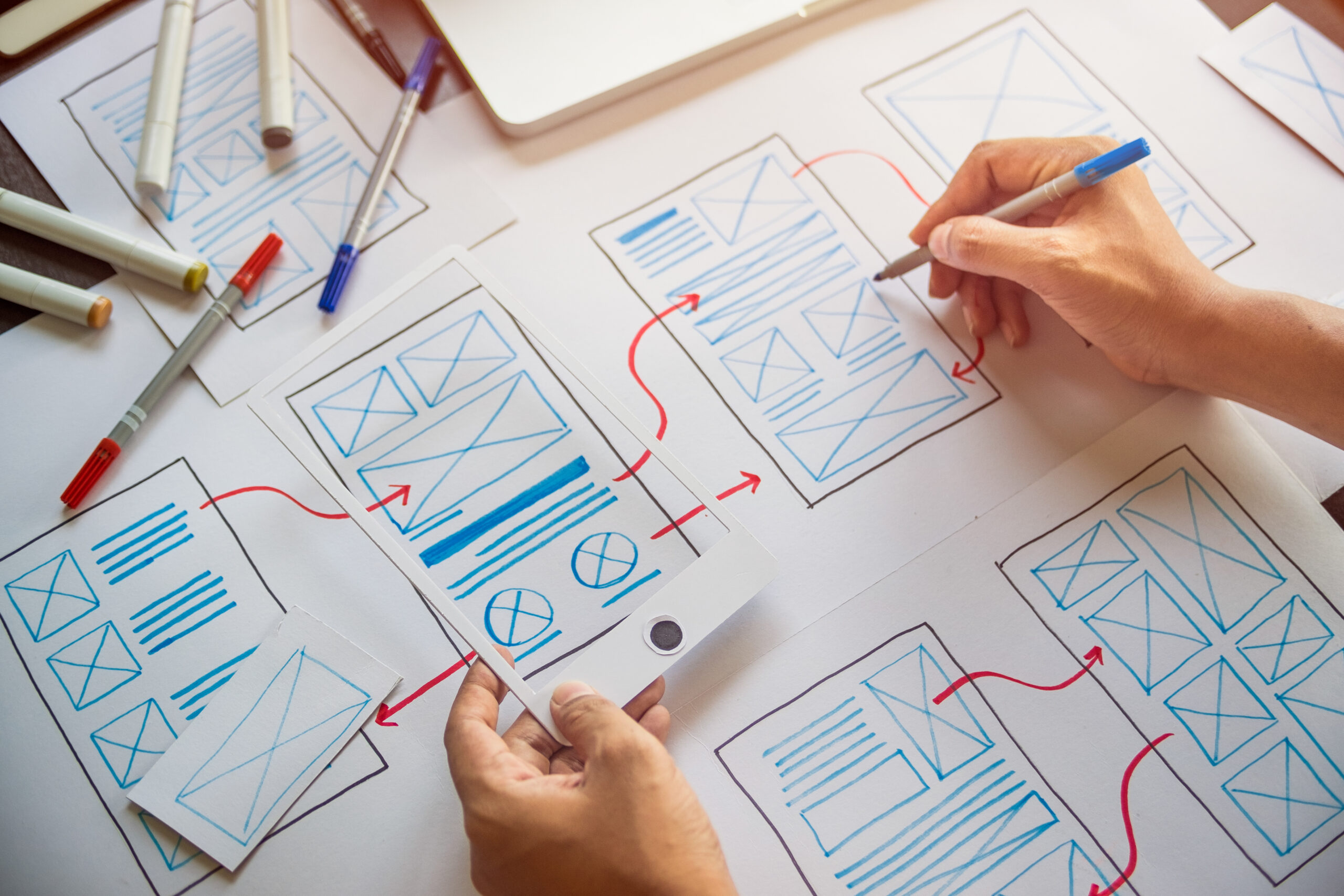
Intuitive User Interface: The Path to Discovery
An intuitive user interface (UI) is essential in guiding users through their digital journey, acting as the path to discovery on a website. It encompasses the layout, navigation, and interactive elements that facilitate an effortless and satisfying user experience. An intuitive UI is user-friendly, predictable, and aligns with users’ expectations, allowing them to navigate a website quickly and efficiently.
Simplified Navigation
The cornerstone of an intuitive UI is simplified navigation. This means having a well-organized, logical structure that users can follow without confusion. Menus should be clearly labelled, categorizations should be intuitive, and the overall layout should guide users naturally toward their desired destination. Features like a sticky navigation bar, breadcrumb trails, and a robust search function can significantly enhance navigability.
Consistent Design Elements
Consistency in design elements across all website pages reinforces familiarity and reduces the learning curve for new visitors. This includes maintaining the same colour schemes, button styles, typography, and placement of key elements like the logo, menu, and footer. Consistency helps build a predictable environment where users feel comfortable and in control.
Clear Call-to-Action (CTA) Buttons
CTA buttons are crucial in guiding user actions, such as purchasing, signing up, or learning more about a product or service. These buttons should stand out through contrasting colours or design features and use action-oriented language that’s clear and compelling. Placement is critical; CTAs should be positioned strategically to catch the user’s attention at the right moment.
Responsive Design
An intuitive UI must be adaptable across devices, providing a seamless experience whether users access the website from a desktop, tablet, or smartphone. Responsive design ensures that the website’s layout, images, and content adjust smoothly to different screen sizes, maintaining usability and preventing elements from becoming too cramped or unreadable on smaller screens.
Effective Use of Visual Cues
Visual cues such as icons, arrows, and animations can subtly guide users towards important information or actions. For example, an animated scroll icon can encourage users to explore further down a page, while icons can quickly communicate the function of a button or link. These cues should be universally recognizable and used sparingly to avoid overwhelming the user.
Feedback and Interaction
Providing immediate feedback for user actions is a hallmark of an intuitive UI. This could be visual confirmation when a form is submitted, an animation when a button is clicked, or a simple error message if something goes wrong. These interactions reassure users that their actions have been recognized and guide them on what to do next.
Accessibility and Inclusivity
An intuitive UI is accessible to everyone, including users with disabilities. This involves adhering to web accessibility standards, such as providing alt text for images, ensuring keyboard navigability, and using ARIA (Accessible Rich Internet Applications) labels for interactive elements. Making your UI inclusive broadens your audience and demonstrates a commitment to equitable user experience.
User Testing and Feedback
Ultimately, the intuitiveness of a UI can best be measured through user testing. Gathering feedback from real users, primarily those unfamiliar with the website, can provide invaluable insights into areas where the UI may be confusing or improved. Regularly updating the UI based on this feedback ensures that the website remains user-friendly and intuitive.
An intuitive user interface is not just about good looks; it’s about creating a user-centric environment that facilitates discovery, encourages interaction, and enhances satisfaction. By focusing on simplified navigation, consistency, responsiveness, and accessibility, web designers can craft intuitive digital spaces that lead users naturally and effortlessly toward their goals.
 Content That Resonates
Content that resonates goes beyond merely providing information; it engages users personally, evoking emotions, sparking curiosity, and building connections. To achieve this, content must be relevant, valuable, and tailored to the audience’s interests and needs. Here are some key aspects:
– Storytelling: Incorporating storytelling into web content can captivate users. Sharing brand stories, customer testimonials, or case studies in a narrative format can make content more relatable and memorable.
– Quality and Clarity: High-quality content is well-researched, accurate, and written. It avoids jargon and complex language, making it accessible to a broad audience.
– Visual Content: Using images, videos, infographics, and animations can enhance textual content, making complex information more accessible, engaging, and easily digestible.
– Interactivity: Interactive elements like quizzes, polls, and infographics can increase user engagement by making the content experience more dynamic and personalized.
– Regular Updates: Keeping content fresh and up-to-date is crucial. Regular updates signal to users and search engines that your website is a reliable source of current information.
Seamless Functionality: The Key to Satisfaction
Seamless functionality ensures users can navigate and use a website without encountering obstacles, leading to a satisfying experience. Key components include:
– Speed: A fast-loading website is essential. Users are likely to leave if a site takes too long to load, so optimizing images, utilizing caching, and minimizing heavy scripts can improve loading times.
– Mobile Optimization: Mobile optimization is crucial with the increasing use of smartphones for web access. A mobile-friendly website should feature a responsive design, touch-friendly navigation, and content that adjusts smoothly to various screen sizes.
– User-Friendly Forms: Online forms should be concise and straightforward, asking only for necessary information and providing clear instructions for completion.
– Error Handling: Websites should have helpful error messages and pages not found (404) that guide users to relevant content or the homepage.
– Cross-Browser Compatibility: Ensure your website functions correctly across all major browsers and their versions to reach a wider audience.
Influencing User Behavior Through Design
Web design can influence user behaviour, increasing engagement and conversion rates.
– F-Layout and Z-Layout: These layouts mimic the natural reading patterns of users in Western cultures, placing critical information and CTAs along these paths to catch users’ attention.
– Color Psychology: Colors can evoke specific emotions and actions. For example, contrasting your CTA button’s colour can make it stand out and encourage clicks.
– Hick’s Law: Reducing the number of choices can streamline user decisions. A simple, straightforward navigation menu with fewer options can enhance user experience and guide users to take desired actions more efficiently.
– Social Proof: Incorporating elements like customer reviews, testimonials, and social media feeds can build trust and encourage users to take action, seeing that others have had positive experiences.
– Scarcity and Urgency: Indicating limited availability or time-sensitive offers can create a sense of urgency, prompting users to act quickly to get all the benefits.
By combining content that resonates with seamless functionality and strategic design elements, websites can create compelling user experiences that satisfy and inspire users to engage more deeply and take desired actions.

Designing Digital Journeys
By marrying the principles of human psychology with strategic web design, websites can become powerful tools that fulfill business objectives and offer enriching user experiences. Employing persuasive language, social proof, visual storytelling, and data-driven insights can transform a website into a platform that captivates and converts.
Crafting such a website requires a deep understanding of web design and user psychology. For businesses looking to elevate their online presence, partnering with a web design company that grasps these nuances is crucial.
A website designed with the user in mind is more than just a digital space; it’s a journey that guides each visitor toward the desired action, whether making a purchase, signing up for a service, or simply engaging more deeply with content.
Unlock Your Digital Potential
MRKT360 stands out in web design, blending psychological insights with creativity to create websites that reflect your brand and connect with your audience.
They excel in creating custom designs that attract and convert visitors into loyal customers. As a leading website design agency, MRKT360 is dedicated to enhancing your online presence through the strategic use of web design psychology.
Partner with MRKT360 to elevate your digital identity and achieve unparalleled business success through a website designed to engage users and drive growth.
